
Interview with designer David Turner regarding his album cover work for Lulu, a 2011 release on the Warner Bros./Vertigo labels, based on a collaboration between musical artists Lou Reed and Metallica (and winner of a “Gold Award for CD/DVD Packaging” in the 2013 Graphis Annual).

by Mike Goldstein, AlbumCoverHallofFame.com
During a press interview about their collaboration on Lulu, Metallica drummer Lars Ulrich recalled the late Lou Reed’s challenge to the band, asking them “are you game for a little adventure – do you want to go on a ride with me?” They well-understood what working with Reed would entail, having performed together in 2009 at the Rock & Roll Hall of Fame’s 25th Anniversary concert and being witnessing first-hand, in rehearsals, why he had a well-deserved reputation as a perfectionist (during which, via sheer force of will, they earned his respect and an invitation to work together again under the right set of circumstances).
Those circumstances arose a couple of years later when Reed asked the band to work with him to set music to lyrics he’d created based on German playright Frank Wedekind’s “Lulu” series of plays written at the turn of the 19th & 20th centuries (and later re-interpreted in the great silent film Pandora’s Box by GW Pabst). Wedekind, also well-known for his play Spring Awakening, created stories (quite scandalous at the time) in which the main character, Lulu, dances her way through German high society in tales involving sex, lies and murder in degrees never before depicted in the theater. The poems/lyrics that Reed created to retell these stories needed music with the weight and energy that a band like Metallica produced naturally so, again, Lou tasked the group to work with him in methods outside their normal “comfort zone” – in other words, impulsively, without the thought, analysis and studio precision that they were used to in a recording session.
Having successfully lived up to the challenge of creating new music with a man considered one of the ultimate music industry “outsiders” (perceiving themselves as always having been outside the musical mainstream as well), the band turned to designer David Turner of the international design firm Turner Duckworth, who had worked with them on the highly-lauded, Grammy Award-winning packaging for 2008’s Death Magnetic, to come up with designs for the record that would best-reflect the unique nature of the music inside. The resulting packages – including a limited-edition deluxe, 12″ square bound hard-cover version with an illustrated lyric book and a book of photos of the musicians shot in Sweden by 2013 ACHOF inductee Anton Corbijn – were honored with a “Gold Award for CD/DVD Packaging” in the 2013 Graphis Annual. I was eager to learn more about the process and inspiration behind these stunning products and, with the help of David Turner and his team, I’m happy to provide you, my readers, with the details …
Interview with designer David Turner (interviewed early-mid December, 2013) –
Mike Goldstein (Curator, AlbumCoverHallofFame.com) – Thanks so much for your time today, and congratulations on your new Grammy nomination. Let’s start at the top – can you please tell me how is it that you were first introduced to the musical acts involved in the project. Had you worked with any of them before?
David Turner (designer, Turner Duckworth) – We had worked with Metallica on the packaging and marketing efforts for their ninth studio album, Death Magnetic. The band introduced us to Lou Reed as they were collaborating with him on the Lulu album.
Mike G – What were the inspirations for the original concept and final image? Did any of the artists’ music, reputation or performing style provide you with some inspiration as to how to develop the style guidelines for the imagery you’d propose? And, for inspiration, did they let you see/hear any of the lyrics/music that was going to be on the record?
David T – Because this collaboration was unique for everyone involved, there was a deliberate effort to make this packaging look different from past projects. The music definitely was an inspiration, since Lou had written the original lyrics for a previous musical based on Frank Wiedekind’s Lulu plays from the early 1900s. The main character was broken in many ways, and exhibited behavior both human and heartless. We found the mannequin featured in the packaging at the Museum der Dinge in Berlin. It felt appropriate both for the mood and the era of the plays. Once we showed her image to the band and Lou, everyone felt we had found our Lulu.

Lulu mannequin being retrieved from museum storage
MG – I understand that this record featured a number of songs, but was there a particular track on the album that served as the inspiration of the package art/design?
DT – The songs tell the complete story of Lulu, so every track contributed to the work. That’s why, in the lyric book, we chose to create an image for each song.
MG – Once you’d found your main character, can you describe how you then arrived at the final design?
DT – The packaging design reflected Lulu’s delicate balance of humanity and ‘soullessness’ by melding the female form – shot live in-studio – with that of a period-appropriate mannequin found in the Museum der Dinge in Berlin. I think that the resulting design mirrors the artistic musical approach in a distinct style that we felt is not normally associated with either iconic artist. The concept extended beyond CD packaging to this limited edition deluxe set, while the basic version is packaged in a tube that contains an oversized lyric poster and detachable folding CD case.
MG – So there were really two “special” editions – one that came in a tube with a poster and some photos, while the other was a more-conventionally-shaped box set with the books. Is this right?

Special tube packaging, with contents

Sample pages from book included in limited-edition packaging
DT – Yes, that’s right – we had to develop designs for two special edition sets – the tube and the books. Stan Musilek shot all the non-band imagery, so his photos appeared in the standard CD packaging as well as the tube, poster and lyric book from the special edition sets.
MG – How involved were the artists, or their management or the record label management, in the process of deciding what you should produce, and did they provide you with any specific direction? Did they give you enough resources and/or time to do what you wanted to do? Do you think that they were they happy with the results and, if so, how did they express that to you?
DT – We were lucky in that we had a great relationship with our clients, and they gave us the freedom to come to them with our design recommendations, without any mandates. When we showed initial ideas, the musicians were unanimous in their choice of the mannequin concept. They were all passionate about the work and very appreciative. Lou would call frequently to discuss specific details of each image and to push us to be ever more creative, but neither he nor the guys from Metallica were ever prescriptive – they respected our artistic point of view. We did this project for the pure pleasure of it. Neither Stan (Musilek, the photographer) or I charged anything for our time so that we were able to put all the available funds into the production of the pieces. The band covered all costs and it was still an expensive project for them since the packaging is quite elaborate and there were two special editions. I’m sure that everyone was delighted with the results – no one did it for the money!

Photographer Stan Musilek with Metllica’s Lars Ulrich and Lulu the Mannequin
We wanted to differentiate this work from any other graphics Metallica or Mr. Reed had used in the past and, since Lulu was an art piece for Lou Reed and Metallica, we wanted the packaging style to have an art gallery feel. I know that the designs were well-received as they led to an art gallery opening at Steven Kasher Gallery in New York, with the packaging photography on display as large scale photographs. (Editor’s Note – they were also somewhat controversial, as advertising posters for the album were rejected by censors from the London Underground who thought that the ‘Lulu’ writing looked too much like graffiti!).
MG – After you’d developed the brief for the project, what “guidance” or specific instructions did you then provide the illustrators, photographers and designers that created the key parts of your package?
DT – Once we knew what our packaging cover would be, we collaborated with the photographer, Stan Musilek, to concept the additional images for Lulu. We actually found the additional objects we shot while on location at the Museum der Dinge and worked on the set to align the images with each of the tracks on the album.
MG – While I understand that the mannequin was from the Museum der Dinge in Berlin, I’m curious as to how this particular mannequin was located – had someone seen it during a visit, or did you have a relationship with the museum, or ??
DT – I had seen an article somewhere about the museum and the mannequin was pictured in the article, so we contacted the museum to see if they would be willing to allow us to shoot it for this project. I’d like to note that, during the shoot, we became friends with the great staff at the Museum der Dinge and so, in addition to capturing some great images, we got to experience a beautiful city from an insider’s point of view.
MG – How did you ultimately choose the talent who would work with you on this effort? Also, can you please clarify who actually took the photos, as I’ve seen credits given to both Anton Corbijn and Stan Musilek for album photography…
DT – Stan Musilek was the photographer for all the conceptual images and Anton Corbijn photographed the band members. One of the special editions of the album was composed of two books, one of which was a book of Anton’s photos of the band, with typography that he designed, and the other was a book that we designed of conceptual images and the lyrics, and the imagery for this second book was shot entirely by Stan.

Clockwise, from upper left – Preparing the mannequin for its close-up; photographer Stan Musilek in the studio; painting text with pig’s blood; David Turner and Production Director Craig Snelgrove discussing design of Lulu text.
MG – Were any “special effects” or tools used to create elements of the final album cover image, or the entire image?
DT – Stan’s digital team used good old Photoshop to combine the mannequin body with that of the live model, and to combine the “blood” type with the object images.
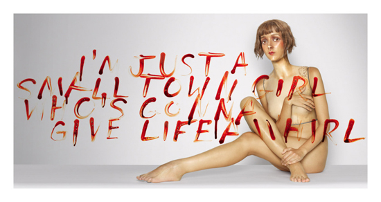
Full spread of Lulu album cover
MG – In addition to coordinating all of the talent, how long did this process take – from start to finished product?
DT – It took us about 3 months from start to finish.
MG – When all was said and done, did you consider your efforts to be works of self-expression, or did you take your lead from your clients?
DT – Both. We were inspired by the music and the ideas within the lyrics, and we collaborated closely with Lou and Metallica, with them approving all our work. However, it was also a very personal project, because unlike most of the projects we work on which are highly commercial in nature, this was an opportunity to create images as art, for the sheer pleasure of creative exploration, because that was the driving force behind the music.
MG – David, if you don’t mind, I’d like to ask you a few more questions about some general topics I’d be interested in getting your opinions on. First off , with the electronic delivery of music products growing at a fast pace, are you noticing any more or less enthusiasm on your client’s behalf to invest time and money in packaging that stands out?
DT – Metallica recognize that many of their fans want more than just the music – they want an experience. For that reason, they invest in packaging design and production so that the fans who want to buy a physical CD are rewarded for doing so. It’s still an important medium.
MG – How does album cover art help us document human history? Personally, I believe that iconic album cover art – in many ways – has had a noticeable effect on Pop culture, so I’d like to get your take on this – is the imagery and music providing the direction, or is it reflecting the culture, or ??
DT – Art is a reflection of our culture, but it also inspires it. The creative inspiration for this project spanned over a century and included many different interpretations of Lulu. Hopefully the work we created will inspire others. We like to create work that will not become quickly dated, so we deliberately avoid visual trends and look to the music for inspiration, in the hope that it will lead us to a unique visual point of view. Musicians tend to be more open to experimental visual ideas, so designers who are trying to do new things often work in music. This means that new design trends frequently originate in the music business. However, the majority of album covers are not innovative and simply mirror the visual trends of the time. The very best covers are either stylistically groundbreaking and so become clearly identified with the era of their creation – because they are so frequently copied – or they exist outside visual trends and become timeless. It’s the latter that we’re interested in.
MG – Can you tell us what happened to the original artwork for this release?
DT – The artwork exists digitally, but we did have prints done for the photography show at the Stephen Kasher Gallery in NY that I mentioned before.
Editor’s note – Here are a couple of links to interviews done for Rolling Stone and AP with Lou, James Hetfield and Lars Ulrich re: the project.
http://www.youtube.com/watch?v=COQ84jm4JlI
http://www.youtube.com/watch?v=W3yy6rcXa4o#t=13
MG – Finally, in your opinion, what made Lou Reed – the artist and his music – different from other artists in his “category” or of his day?
DT – I don’t consider myself really qualified to say because, before this project, I was not particularly familiar with all of Lou’s music. However, I got to know him a little working on Lulu and I felt compelled to write an obituary the day Lou died:
Lou Reed 1942 – 2013
We had the unique experience of working with Lou on the visual identity and packaging design for “Lulu,” a collaborative project he did with our clients, the rock band Metallica.
As he pointed out during one call, he came from the “University of Andy Warhol” and had been a hugely influential, and often controversial, figure in music and culture in general. So when we found out we’d be working with him, we knew we were going to learn something.
From the outset, he was unlike any client we have had before or since. He always spoke his mind, with no reservation or attempt at diplomacy. He could be mercurial, but he was always driven by a passion to do something extraordinary. He was hugely appreciative of the creative work we did and would continually push us to take it further and defy convention. He would berate anyone he felt was diluting the creative process and his visceral, authentic enjoyment of our work was incredibly inspiring.
To describe what was most impressive to us about Lou, we have stolen a phrase from one of his emails to us: It was his “purity of intent.” He was a true artist, fearless in the pursuit of creativity.
Here’s that email:
True pleasure working with you all under this pressure and achieving such a BEAUTIFUL PACKAGE.
THANK YOU ALL. For the ages and for the purity of intent.
lou
So thank you, Lou, for the ages, and for the purity of intent.
Editor’s Note – I’d like to extend special thanks to Turner Duckworth studio manager Amy Parrish and group account director Jessica Rogers for their help in getting all of the materials together for this article.
About the artist, David Turner –

After initially being rejected by his chosen art school, David ultimately graduated with a first class honors degree from St.Martin’s School of Art in London. He started his career working for the charismatic Marcello Minale (winner of the prestigious D&AD “Lifetime Achievement: Designer Award”) from whom he learned two important things: First, that without an idea, graphic design “is just wallpaper” and, secondly, not to take himself too seriously. While at Minale Tattersfield and Partners (now the Minale Tattersfield Design Strategy Group, headquartered in London) he completed branding and packaging projects for clients in the UK, Europe and Japan.
In 1993 he started Turner Duckworth with partner Bruce Duckworth. A few months later he left for San Francisco to pursue and marry his wife Ellen. Turner Duckworth became international, with offices in London and the Bay area, but the partners continue to work as if they still share a table and the spirit of international collaboration defines Turner Duckworth culture.

Turner Duckworth’s San Francisco offices (Photos by Mariko Reed)
Turner Duckworth creates iconic design for brands ranging from global behemoths like Coca-Cola, Levi’s and Amazon.com to feisty start-ups like Opentable.com and Popchips. As well as helping achieving outstanding commercial results, their designs consistently win many of the industry’s most prestigious awards and have been published broadly. The company won the first-ever Cannes “Grand Prix for Design” in 2008 for their work with Coke and a Grammy Award in 2009 for their work with Metallica. That same year, Creativity Magazine named David as one of the USA’s “fifty most creative people”.
In addition to their 2008 Grammy Award, Turner and his crew are up for a Grammy Award this year for their work on Metallica’s Through The Never (Music From The Motion Picture) on Blackened Records. We’ll update this story with the results after the awards are handed out in late January…
For more on this artist, please visit his web site at – http://www.turnerduckworth.com/
About this AlbumCoverHallofFame.com interview –
Our ongoing series of interviews will give you, the music and art fan, a look at “the making of” the illustrations, photographs and designs of many of the most-recognized and influential images that have served to package and promote your all-time-favorite recordings.
In each interview feature, we’ll meet the artists, designers and photographers who produced these works of art and learn what motivated them, what processes they used, how they collaborated (or fought) with the musical acts, their management, their labels, etc. – all of the things that influenced the final product you saw then and still see today.
We hope that you enjoy these looks behind the scenes of the music-related art business and that you’ll share your stories with us and fellow fans about what role these works of art – and the music they covered – played in your lives.
Except as noted, all images featured in this story are Copyright 2011 – 2013, Turner Duckworth – All rights reserved – and are used by the artist’s permission. Except as noted, all other text Copyright 2013 – Mike Goldstein, AlbumCoverHallofFame.com (www.albumcoverhalloffame.com) & RockPoP Productions – All rights reserved.

Pingback: Album Cover News Recap – January 2014 | Album Cover Hall of Fame.com