
Album cover hall of fame’s Featured Album Cover Artist Portfolio and Interview with Art Director Larry Vigon
By Mike Goldstein, AlbumCoverHallofFame.com
Posted February, 2020
In my wife’s list of “all-time favorite albums”, Fleetwood Mac’s smash hit Rumours is certainly in the Top 5, up there with great records by Carole King, Linda Ronstadt, David Bowie and Queen (I did confirm this list with her, correcting it as needed but, after 40+ years of togetherness, I’m happy that I initially got most of the list right). Even a prog rocker like me found much to appreciate in the band’s music (how can you not like Lindsay Buckingham’s wailing guitar solo at the tail end of “The Chain”?) and, after sales of over 40 million copies world-wide (over 20 million in the U.S. alone) since its 1977 release, it must also be considered as having one of the most-seen album cover images of all time. Of course, most of us will recall the arresting Herbie Worthington photo of the very tall Mick Fleetwood, with foot raised on a small stool (and what exactly were those balls seen dangling between his legs?) standing next to the mysterious, black-veiled form of one of the group’s two new members, Stevie Nicks. Those of us, though, who appreciate fine design were just as taken by the beautifully scripted logo/title found on the cover, which I later found was done BY HAND by Larry Vigon, one of this year’s inductees into the Album Cover Hall of Fame in the Art Director category.
Part of the preparation for each year’s nominating/voting process finds me working to provide our Voting Panel with a fair amount of information on each nominee. Occasionally, this proves to be a daunting task as some of the people put forward for consideration have an enormous portfolio of album cover credits to look at. And then, there’s someone like Larry – a multi-talented designer/typographer/art director who has several hundred record packages on his resume. I attempted to whittle down the list to what I considered (and who am I?) his most-notable album cover credits, which include designs for records such as Eric Clapton – Behind The Sun; Counting Crows – August And Everything After; Thomas Dolby – Astronauts & Heretics and Close But No Cigar; Pablo Cruise – Reflectors; Bob Welch – Bob Welch; Missing Persons – Rhyme & Reason; Oingo Boingo – Dead Man’s Party; Boney James – Sweet Thing; Chicago – Chicago 17 and Night & Day; Olivia Newton John – Warm and Tender; Bonnie Raitt – Nick Of Time; The Rembrandts – The Rembrandts; Rick Springfield – Rock Of Life; Richard Marx – Rush Street and Paid Vacation; Tom Petty & The Heartbreakers – Tom Petty & The Heartbreakers; Sparks – In Outer Space and Pulling Rabits Out Of A Hat along with the records he did for Fleetwood Mac – Fleetwood Mac, Rumours, Mirage and Tusk (can anyone say “WOW”?). Upon completing that task, it became clear that this was someone who might have some stories to share.
After contacting Larry about his induction, it became an imperative to give you, my readers, a more-complete look into the man and his work, and Mr. Vigon was kind enough to agree to work with me to bring you one of my Featured Artist Portfolio articles, vehicles which allow me to introduce an artist, give you some of his/her back-story and then, most-importantly, some of the details behind what went into the making of some of that artist’s best-known works – details that can only help you better-appreciate the artistry and imagination brought to each project. I started by asking Larry to select some of his favorite examples from his lexicon and to share a tale or two about each, the result of which follows below. Following this part of the presentation, you’ll find an interview with Larry and some biographical info as well, but let’s begin our tour:

FLEETWOOD MAC – RUMOURS
About this image – When I was at the Art Center College of Design, Fleetwood Mac was one of my all time favorite bands. It was long before Stevie and Lindsey joined the band, when it was Fleetwood Mac, the English blues band lead by Peter Green. After art school, when I got the call to work on a new self-titled Fleetwood Mac album (Editor’s note – 1975’s Fleetwood Mac was the second eponymous LP from the group, the first being their 1968 debut record), I couldn’t believe my luck. It was the first album with the new lineup including Stevie and Lindsey. I designed and hand-lettered the logo for that package, which went on to become a multi-million seller. After the success of that album, in 1977 I was asked to do the same for Rumours. You never know when you are working on the next big thing. Rumours became one of the biggest selling albums in pop/rock music history, selling somewhere in the neighborhood of 40-50 million copies. For many years after its release, I received emails from designers from around the world wanting to know what font I used, and I always had to explain that it is a pre- computer, hand-lettered logo – done only for that album – and so there is no “rest of the alphabet”. I’ve seen attempts at adding letters to the logo and it always looks terrible. The inspiration for the lettering was taken from the photo. The tall F and condensed letters were echoing the 6 foot 6 inch height of Mick, and the sweeping lines of the A, the R and the S were inspired by Stevie’s cover pose. I recently saw Fleetwood Mac in Las Vegas, and they are still using the logo I designed over 43 years ago.

FLEETWOOD MAC – TUSK
About this image – Tusk was the follow up album to Rumours. The band did not want to do Rumours 2; the music on this recording would be much different and so the packaging had to reflect that change. My brother Jay and I were co-art directors and designers on this project. We hired three photographers for this project: Peter Beard for his richly textured journal-keeping, Norman Seeff for his classic rock style and Jayme Odgers for a surreal take on the band. Peter hung out in the recording studio for two weeks documenting the band during the recording process. The cover shot is of producer Ken Caillat’s dog Scooter tugging on Ken’s pant leg. Scooter was just playing, but he looks ferocious. This was one of the last double album package extravaganzas and at the time, not loved by some die hard FM fans. I actually received the entire package in the mail, completely torn to pieces as a protest to this new look.

FLEETWOOD MAC – MIRAGE
About this cover – I was in New York for work but I had some time off, which I spent at an art museum. As I was leaving MOMA, I saw a sign pointing to a photography exhibit by George Hurrell. I wasn’t familiar with Hurrell’s work but, once I saw his photos, I was blown away. George Hurrell had photographed almost every major movie star since the 1930’s and his beautiful black and white prints were so impressive that I tracked him down as soon as I had a new album cover project. I didn’t even know if he was still alive, but I did finally reach the then-80-year-old photographer in Los Angeles and found him to be very friendly and eager to take on a new project. He still used his original wooden body 8×10 camera with one single light source. Mirage is the second project we did together. The first was the package for Lindsey’s solo album Law & Order, and we also did materials for Alexander Godunov’s world ballet tour. George and I became good friends and we would have lunch together every week either at Musso & Frank or the Brown Derby and he would regale me with stories of old Hollywood. George died in 1992.

BOB WELCH – THE OTHER ONE
About this image – My wife Sandra and I were in Paris, and one night we went to a burlesque club with Mick Fleetwood and his security man, Dennis Dunstan. There was a great atmosphere in the club, a smoke-filled room in dark red and black tones, with people from all over the world and everyone drinking champagne. In between the very sophisticated striptease acts were comics and other entertainers, one of which was a hand shadow artist. He didn’t just make rabbits and dogs – he made portraits of Nixon and Reagan and other elaborate shadows. When I returned to L.A,. I received a call from my friend Bob Welch wanting me to do his new album called Watch The Animals, which was later changed to The Other One. Having just seen this remarkable shadow artist, I suggested an animal shadow as the cover image. Bob liked the concept and it still made sense even after the title change. Liz Sowers was the photographer, and here is a photo of Bob and I taken back in 1979 at the photo shoot in my apartment.

That is Bob’s hand making the shadow. Bob was a good friend and, besides being a talented musician and writer, he was very smart and had a great sense of humor. Bob died in 2012.

CHICAGO – 17
As I said before, you never know when you are doing the next big album, and Chicago 17 turned out to be their biggest selling album ever. The “Chicago” logo was well established (Editor’s note – originally designed by John Berg and Nick Fasciano, it first appeared on the band’s second studio album, released in 1970, with the designers winning a Grammy Award for their work) when I got the call to design this album; it was all about how to treat the logo. I had a woodworker make me a 3D version of the logo, which I wrapped in a linen fabric and airbrushed across the wrapped logo at an extreme angle. I then unwrapped the linen, stretched it over heavy cardboard and worked on the details with pencil and pastel. I had a rubber stamp made for the 17 and tied the final piece with twine I had covered with acrylic paint. Robert Lamm told me how much he liked what I’d created for the band and, when it came time to do the cover for Night & Day ten years later (in 1995), he told me that they’d wanted me on the job as they weren’t too happy with their covers since Chicago 17. I took that as quite the compliment.

ERIC CLAPTON – BEHIND THE SUN
It was 1984 and I was in London. Warner Bros. asked me to do the sleeve for next Eric Clapton album and so I met with Eric’s manager at the time, Roger Forrester. Roger said this new album was much more up beat the previous few albums, so I got to work on Behind The Sun. About a week later, I met with him again, this time to show him my idea for Eric’s new cover. He took one look at it and said it was the worst cover design he had ever seen. As he talked to me about this ‘terrible cover’, he kept glancing down at the painting and eventually said, “This isn’t SO terrible” and continued on with the conversation. Within half an hour, he thought the painting was “perfect” and a wonderful, up beat solution for the cover. Eric liked it immediately.

COUNTING CROWS – AUGUST and EVERYTHING AFTER
I met with the band’s singer and song-writer Adam Duritz at the Geffen Records office on Sunset Blvd. in 1993. We spoke for about an hour and he said the band was signed mainly because of his writing, not his singing or the band’s outward persona. I thought that was interesting and asked him if he could give me some of his hand-written lyrics to try out some ideas for a cover design for this debut album. I started off by scanning the lyrics and tweaking the color and then, on an overlay, I wrote “Counting Crows” straight out of the ink bottle with the eyedropper. I wrote the title with a dipping pen. Once again, you never know when you are doing “the next big album”, but August and Everything After has since sold over 10 million copies worldwide.

OINGO BOINGO – DEAD MANS PARTY
I met Danny Elfman in L.A. in 1985. He told me he had just written some theme music for a new TV show and that he had loved the experience and was looking forward to doing more theme music. I asked him what the name of the new show was and he said, “something called The Simpsons”. As we all know now, Danny Elfman went on to be one of the most in-demand movie score writers in the business. I did the art direction and design for this fun project. Jayme Odgers was the photographer and his girlfriend at the time, Celeste Williams, made the clay figures while Jayme and I made the sets and tissue border. That is a real sparkler stuck in the backdrop just over the painting of a volcano. Some of the figures were moved a little during the exposure to add a sense of movement. I’m happy to say that Danny purchased the final set-up for his own collection.
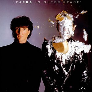
SPARKS – IN OUTER SPACE
I don’t know if any of you reading this have ever had the joy of throwing a cream pie in someone’s face but, as an art director, I have. This is beyond a doubt the funniest photo shoot I ever directed in my 47-plus years in the business. I art directed and designed four album covers and several single sleeves for Sparks. Ron and Russell Mael always like to meet at The Farmer’s Market at 3rd and Fairfax in L.A. to discuss new projects. This time the concept was that Russell would remain perfectly still and have no reaction to Ron being hit in the face with a cream pie. Jim Shea was the photographer on this project. We all met at the photo studio – the hair person, makeup, clothing stylist, photo assistant, etc. I had a stack of 10 cream pies to make sure we’d get a good take. Everyone was in position as I threw the first pie and, BINGO!, a perfect shot. Myself, Ron, Russell and the entire crew literally fell on the floor crying and doubled up with laughter. Then we had to clean up Ron, recompose ourselves and I threw the next pie, again with the same results. The shoot took forever to finish, what with all the laughing and cleaning up, but it was worth it.

BONEY JAMES – SWEET THING
This is one of six covers I did for Boney James and by far the most controversial. We’d met when I was hired to work on the package for his Seduction album and he’d had something in mind – an image of a sexy lady – while I suggested that, rather than showing the obvious, he’d be better off with taking a more metaphorical approach to the cover image (a scene of moths fluttering about a light bulb). He was very happy with the results and we agreed to adopt that approach for the next several records. For Sweet Thing, the piece of fruit you see was cut in half and the pit taken out. The original design had a black and white photo by James Minchin on the cover. Nothing was done to this piece of fruit – no retouching – just shot as-is. After seeing the photo, a very upset head of the Warner Bros Jazz label called me and said, “You can’t show a vagina on the cover of this album,” to which I replied “that it’s not a vagina, it’s a piece of fruit.” The conversation went back and forth for two weeks, with the final compromise being to use a color photo because they felt it looked “less human” than the black and white version!
These are just 10 album packages out of I don’t know how many that I art directed, designed or illustrated. I have also done packages for Tom Petty, Thomas Dolby, J.J. Cale, Clint Black, The Rembrandts, Missing Persons, Carole King, Pat Benatar, Ian Dury and The Blockheads, Mr. Mr., Bonnie Raitt, Richard Marx, The Four Seasons, Taj Mahal, Herb Alpert, Frank Sinatra as well as covers for albums and artists that never became famous. I am equally proud of all the packages I have done because, famous or not, I always gave them 100% due to the fact that I never knew when I was working on “the next big album.”
Bonus interview with Larry Vigon (conducted via email in January and February, 2020)
Since it has been a while since I’ve been able to put together a proper interview article for you, I thought that I’d enhance this Featured Artist Portfolio article with some highlights from an interview I conducted with Larry via email recently. Readers of some of my previous interviews will recognize the basic format here, where I first work to find out more about the interviewee’s past – their education, their intro to working in the music business, etc. – and then move on to more philosophical questions. Since Larry’s still active in the area (with a studio in the Santa Barbara, CA area, the lucky guy!), I really appreciated his willingness to collaborate with me on this as we worked to give you a reasonable overview of his 40+ year career and the impressive output of his labors. I began as I usually do – asking him about the path he took from being “a regular guy” to being one of the industry’s most-respected album packaging designers…
Mike Goldstein, AlbumCoverHallofFame.com – Larry, I’d like you to think back and tell me how it was that you were first introduced to the notion of doing album artwork for clients in the music business. Was it something you’d set out to do, did you “fall in” to an opportunity or was it in some other way?
Larry Vigon – I have always loved music. I think I have been listening to music on the radio since I was 4 or 5 years old and I can’t think of a better way to make a living than combining my love of music with my passion for creating art. One of my instructors at The Art Center College of Design was Roland Young, the creative director at A&M records. Roland like me and my work and said that when I call on record companies, I should say that he sent me. Yes, I did set my sights on the music business and targeted the record companies and studios that did album cover design with my promo pieces. Breaking into the album cover design community was not easy, but the recommendation from Roland opened doors that would have been closed to a designer fresh out of art school.
Mike G – Sometimes, it’s not just what you know, it’s who you know, right? So, taking into account what you knew about the people involved – the musicians, label execs, etc. – and your overall knowledge of the music business at the time, did you adopt a particular approach to promoting and packaging music, or did you approach each project uniquely? Do you think you have a personal or identifiable style, when even the casual observer would know right away that you’d created a particular design?
Larry V – I would always approach each new job as a unique project. 99% of the time, I would meet the recording artist or band and discuss how they wanted to present themselves to the public. I would then listen to the music to make sure that I got a real feel for what the artist was doing. Some designers have a certain style and you know exactly what you are getting when you go to them. I don’t think there is anything wrong with that, it’s just my preference to do something new and different each time. I don’t have any one style…I like to experiment.
Mike G – With each project being “an experiment” and something you wanted to make sure was unique for each client, it seems that each job would have required the input of various designers, photographers, illustrators, graphic artists, etc., so how did you choose the talent who would work with you on each project? Can you help me better understand the “who typically did what”?
Larry V – For most of the “album cover part” of my career after Vigon, Nahas, Vigon (Editor’s note – the design studio he ran from 1973 to 1980 along with partners Margo Nahas and his twin brother, Jay Vigon), I worked with one assistant, Brian Jackson. I hired Brian right out of Art Center and we worked together for 16 years. Between Brian and I, we could handle all the art direction, design and almost all the illustration. I think my portfolio has only two illustrations that I didn’t do myself. Photographers came by my studio every week and I saw lots of their work. Sometimes, there would be a standout portfolio that I would remember for upcoming projects. I had my favorites I would use regularly, but I was always open to a new discovery. It wasn’t unusual for Brian and I to be working on ten or more packages at the same time, but we always kept up with the demand and still managed to do some pretty good work. Brian has gone on to be a very successful designer in his own right and we are still in touch.
MG – Since a large number of your album covers were created in the pre-Photoshop, pre-Illustrator era, can you tell me whether any special tools were used and incorporated into your work process? How did these help you create memorable finished products, and how did you go about adapting to and/or incorporating new technologies and tools into your work flow?
LV – Then, I was “old school”, using pencils, pens, paint, paper, air brush, French curves, circle templates, etc. Now, I always have an assistant there to do the computer work. I do a fairly accurate drawing or doodle of what I want and then scan it into the computer and go from there. I sit with my assistant and art direct as usual but I’m always looking for that happy accident I hadn’t planned on that can often be better than my original thought. The combination of my old school instincts with newer technologies can yield amazing results.
MG – I’ve heard that take from a number of designers – many are happy that they don’t have to go back to the beginning just to see how something might look with minor changes in design or color. Moving on, I wanted to ask you about the project /production coordination required for each project. Taking everything into account, can you tell me how long this process typically took – from start to finished product?
LV – I work quickly. I’ve had great assistants and a network of the best resources for things such as retouching, print making, hair, make-up and wardrobe, etc. I’d say that most projects took 2 to 4 weeks depending, on the pending release schedule. For a project like TUSK, it took much longer.
MG – While we touched on the details about some of the inspirations and, in some examples, how you collaborated on the some of the projects you described in your Featured Artist Portfolio, I’m interested in finding out just how involved the artist/artist management/the record label was typically (if there was a “typical”!!) in the day-to-day development and review process and, ultimately, who decided what you would produce? Do you feel that you usually got enough money and/or time to do what you wanted to do?
LV – Most of the time, it was left up to me to come up with several ideas based on what I had learned from interviewing the artist. With SPARKS, they would first come to me with the concept and then I would get the right team together to make it happen. Sometimes the artist had a bad idea and it was up to me to get them to come around to something better without hurting anyone’s feelings or making them feel embarrassed.
In the 1970’s and 80’s there was usually a good budget to get things done right. There were a couple of times when a project couldn’t be done because of budgetary reasons. For example, one day I received a call from Jeff Ayeroff, the creative director at Warner Bros. Jeff knew that I was friends with the photographer Helmut Newton and that we had done several jobs together. Jeff said he had a project he wanted Helmut and I to work on and would I please arrange a lunch for the three of us. A few days later, we met with Jeff at Warner Bros. to discuss a package for a newly signed artist named Madonna. Helmut and I came up with the concept of recreating a modern Pieta in the middle of a downtown L.A. street. Unfortunately, the cost for this shoot was too much for a first time, unproven artist, and so that was my “almost doing Madonna’s first album” story.
My second such story began when I was at a party where I met Tori Amos. She told me she had recently signed with a major label and that she was just putting the finishing touches on the recording. A few weeks later, I received a call from Tori asking if we could meet to discuss designs for her debut album and, that afternoon, Tori came to my studio with a demo cassette. I didn’t have a cassette player in the studio, so we sat in my car a listened to her entire album – it was great. I would have loved to do her cover, but the record company wouldn’t allow the use of an outside designer for a first time, unproven artist. So, as you can see, sometimes the budget just wasn’t there.
MG – Were your clients generally happy with the results and, if so, how did they express that to you?
LV – My clients were always pleased with the results. As you can see from my portfolio, the artists, record companies and managers kept calling me, so I guess I was doing something right.
MG – I know that you’re still doing design work, so I wanted to ask you about how, these days, do you split your time – or manage your time – between “business development” and actually doing production work?
LV – I’m still taking on commercial projects, but not as many as I used to. In 2006, my wife and I moved to Italy and lived there for two and a half years, during which time I only did one project, and that was Carl Jung’s Red Book. The rest of the time I spent painting. Then, we moved to London and, for the next 10 years, I took on more work but I still had time to do my personal work and continuing to paint. I don’t really go out looking for work anymore, but I’m always excited to start a new project when it comes my way.
MG – So now, we’ve come to the part of the interview where, without betraying confidences, I’d like to ask you if there is any other anecdotal info about any of these projects you’d be willing to share…every project I’ve ever looked into seems to have something of an “a-ha moment” or an “OMG moment”, so anything you’d be willing to share would be quite a treat!
LV – I have been welcomed into the inner circle of many famous recording artists and I’ve seen a lot. I think it’s important not to talk about what I’ve seen while being with people when they have let their guard down and were just being themselves. My “a-ha moments” are usually creative insights.
MG – I totally get your response and approach to respecting that “whatever happens in the studio, stays in the studio,” and so we’ll now move on to everyone’s favorite part of an ACHOF interview – the general philosophical questions I try to pose to every creative person I talk to. Let’s start with this – Are you noticing any more or less enthusiasm from your music industry clients to invest time and money in promo designs and packaging that help their products stand out from the what’s become a very crowded marketplace?
LV – Although I still love music – I can’t work without it – I’m not up on the music industry any more. Obviously, most album graphics are seen at much smaller size on iTunes, smart phones, etc. In the 1970’s and 80’s, the unveiling of a 12” LP recording was an event – you held it in your hands and poured over it while listening to a whole album for the first time. I think cover graphics these days need to be simple and bold and good for marketing. I particularly liked the series of covers done for the Ed Sheehan albums Multiply, Divide, Shape and No.6.
MG – Great examples – I was particularly fond of the illustration Kasiq Jungwoo did for ÷ (Divide) – quite arresting! To go on, can you share feelings about album artwork-related design, photography and production these days? Are there any musical acts, labels, art directors, etc. that you think are keeping the field alive or important? Do you think album art and packaging (including work for “special products”) matters anymore?
LV – Art always matters. The world would be a really dull place without it, don’t you think? Even a 1” square thumbnail image of an album cover on iTunes is more attractive than a simple listing. It reminds me of a poster I once saw that stated “Earth without art is just Eh”.
MG – Personally, it is my belief that, in many ways, iconic album cover art has had a noticeable effect on Pop Culture. Do you think that album cover art help us document modern human history? What’s your take on this – is the imagery and music providing the direction, or is it reflecting the culture, or ??
LV – Just like hearing an old song, or smelling a familiar aroma, seeing an album cover from a certain period of your life can bring memories – good and bad – rushing back.
MG – As a collector, I follow trends in the art sales/auction world regarding how album cover-related art is valued. As an artist, are you noticing any more or less enthusiasm within the fine art world – that is, from collectors, gallerists, museum curators, etc. – in their consideration for adding album cover images and packaging designs to their collections? Is the market for these works – as works of fine art and, therefore, collectible – improving, stagnant, etc. and, if so, why do you think that is?
LV – It’s a timely question since I just auctioned off all of my album cover art, original paintings, photos, sketches etc. The collection sold like hot cakes, so I guess there is a good market for music related art.
MG – I saw that auction online and had hoped to add an item or two to my own collection, but collectors with deeper pockets prevailed, so congratulations on the results. Let’s continue on with a question that always elicits a broad range of responses…So, while doing the research for my book project and for some of the bios featured on the ACHOF site, I found examples of something that made me want to work harder to make sure that credits are given where due – those being several incidents over the years where an artist’s work had been used and, on occasion, abused by labels, print publishers, licensing companies and/or other musical acts without permission or without giving proper credit for the work being used. It seems that, in an age where people seem to find it permissible to “borrow” – it sounds so much better than “steal” or “plagiarize” – an artist’s/writer’s/ photographer’s work to help them promote and sell their own products, folks that create original art have been forced to police the print and digital media outlets to do what they can to either stop this unauthorized use or, at least, receive credit for the work they’ve done. Have you – or any of the artists you’ve worked with – been victimized in this way? Is there anything that can/should be done about it, or do you simply chalk it up to being one of the costs of doing business these days?
LV – After I designed the Eric Clapton album Behind The Sun, I went to see Eric at the Hollywood Bowl. I couldn’t help but notice all the merchandise available everywhere you looked. Tee shirts, sweat shirts, programs, etc. The next day I called Roger Forrester, Eric’s manager. I had always been paid at least as much for merchandise royalties as I was paid for the package design, so when I brought this up with Roger, he said I didn’t read the fine print in the contract. He went on to say, “I know you are right and you know you are right but I’ve got you on a technicality, so you just need to mark this up as an expensive business lesson. From that day on I always crossed out the merchandise part of every contract.
MG – A painful lesson, I’m sure, but now we’ll use it as a “teachable moment” for budding artists in the audience.
About the artist, Larry Vigon (in the words of the artist)

I was born in Chicago, Illinois on September 18, 1949. My family moved to Los Angeles when I was 3 years old, where I attended Hancock Park elementary school. When I was 12, we moved to Hollywood, where I attended Le Conte junior high, but after a short time in Hollywood the family moved to Santa Monica, where I attended Lincoln junior high, Santa Monica high school and on to Santa Monica City College. After 2 years of City College, I transferred to the Art Center College of Design in Los Angeles and went on to earn a Bachelor of Fine Arts in Advertising Design degree in 1973.
After graduating, I partnered with two fellow Art Center students – Margot Nahas and my brother Jay and we launched the Vigon Nahas Vigon Studio. I served as joint creative director, art director, designer, illustrator and typographer. For the next seven years – through 1980 – I worked on scores of album cover and single sleeve designs, while I also designed and art-directed a book for Lucas Film titled The Art of The Empire Strikes Back.
Looking to expand my portfolio to encompass the broader entertainment industry and the fashion industry, I started my own studio – the Larry Vigon Studio in the Hancock Park area in LA – in 1980 and for the next 16 years, I made happy clients out of the Hard Rock Hotel and Casino in Las Vegas (where I was responsible for every graphic you saw there), the Glen Williams fashion label, the United Paramount Network (UPN) – including their logo, photographer Helmut Newton (designing a limited-edition portfolio package) and album art for Eric Clapton, Ian Dury and the Blockheads and many others. During this time, I also shared my knowledge and experience with students as a teacher at my alma mater, the Art Center College of Design, now in Pasadena.
In 1996, I partnered with a talented copywriter/business development guru named David Ellis in a new design studio we set up in Studio City that we called VIGON ELLIS. At that point, I started to work with clients in more corporate and diverse sectors such as IBM, Epson, Hewlett Packard, LAX Airport and ValleyCrest (the biggest landscaping company in America) and others while still remaining firmly established in the entertainment world, doing work for the Los Angeles Opera, UCLA Performing Arts, ESPN, Disney, Dreamworks and even designing the Broadway posters for slight-of-hand artist Ricky Jay’s shows (which were directed by David Mamet). Album covers produced in this period include projects for Carole King, Boney James, Jeff Lorber, Clint Black and others.
In 2006, David and I split up (due to philosophical differences) and I worked on my own out of my home studio. I soon got a call from a company called Nutrilite – a $6 billion company that is the largest vitamin and nutritional supplement supplier in the world – who asked me to create a full graphics package for a new division within the company. Finishing the project seven months later (and a fair bit wealthier!), my wife and I then moved to Europe – first, to Italy for two-and-a-half years (living in several towns in Tuscany, where we last lived in a 400-year-old farmhouse that we’d rehabbed) and then for ten years in London, where I worked on my own as Larry Vigon Studio, The diversity in my portfolio continued to grow…from one extreme, designing graphics for Nutrilite and, at the other end of the spectrum, designing and art-directing a special edition of psychiatrist Carl Jung’s Red Book, which was published in 2009 to great acclaim worldwide. This is the most significant Jungian publication to date and one of the most important psychological publications of the last 100 years. Longing once more for the sun and surf of Southern California, we returned to the U.S. – to beautiful Santa Barbara, CA in 2019 – and established my own studio there, where I continue to work today while enjoying the warm sun and beaches here.
Throughout my career, I have been fortunate and privileged to have won numerous awards and have enjoyed a lot of favorable comments from the press. Whilst each and every one is special, my personal highlights are the Gold Award for Editorial Design I received from the New York Art Directors Club; eight “Maggie” Awards for Editorial Art Direction and Design from the Western Publishing Association and, at an award ceremony at the United Nations in 1996, the Performing Arts International “Poster Of The Year” for work I did for UCLA.
My work on the book Dream: A Journal by Larry Vigon (published in 2006 by WW Norton in NY), which was based on my efforts to record – and then paint pictures of – every dream I could remember over the course of 17 years, became the subject of several articles, including two features in Graphis Magazine and one in the publication Psychological Perspectives and the book has been sold all over the world. In addition, my work on logos, marketing materials and album covers can be found in numerous books on these topics, such as The Ultimate Album Cover Album, The Art of the LP and Taschen’s Art Record Covers, to name just a few.
The visual expression of a concept can have an enduring quality and be understood anywhere in the world in a way that language sometimes fails. That has been my life’s work. Whether it is telling a story through a painting, bringing a product to life through designing a logo or selling an idea through graphics, the medium is unimportant to me – it is the message that matters. Therefore, my work spans every form of print, broadcast and interactive media and encompasses every type of client, varying from the music industry to airports to makers of vitamin supplements. As a fine artist, over a period spanning four decades, I have painted both on commission and for exhibitions and have sold my art all over the world to collectors in Hong Kong, Istanbul, Los Angeles, Hawaii, London and Santa Barbara.
I have been happily married to my wife Sandra for over 42 years. Sandra, native of Britain, is a psychoanalyst in private practice for over 30 years. We met in L.A. while I was working on the Rumours album for Fleetwood Mac (she was Christine McVie’s room-mate and Peter Greene’s ex) and lived together there for many years before our moves to Italy, England and then back to coastal California.
To find more information on Larry and his work, please visit his web site at – http://www.larryvigon.com/about/
All images featured in this story are Copyright 1975 – 2020 by their various rights holders and are used in this article for illustrative purposes only. Some images are Copyright 2020 by Larry Vigon – All rights reserved – and are used by the artist’s permission. Except as noted, all other text Copyright 2020 – Mike Goldstein, AlbumCoverHallofFame.com (www.albumcoverhalloffame.com) & RockPoP Productions – All rights reserved.

Pingback: Album Cover Hall of Fame News Update and Summary – Early March, 2020 | Album Cover Hall of Fame.com